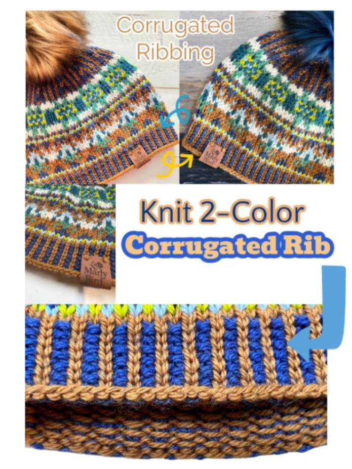
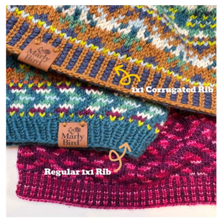
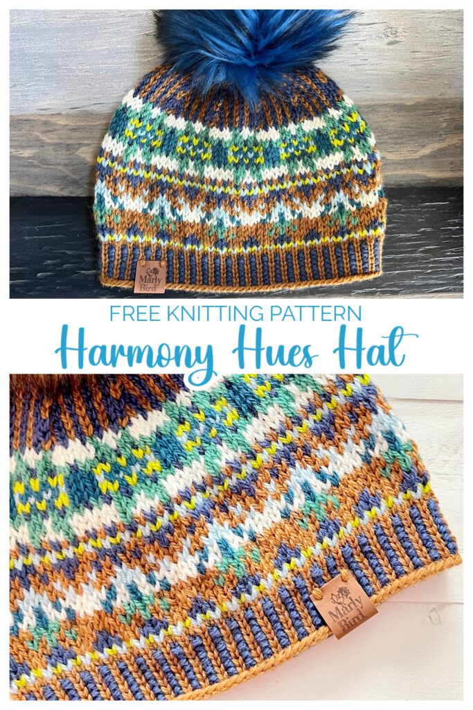
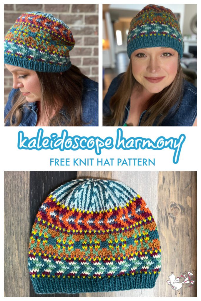
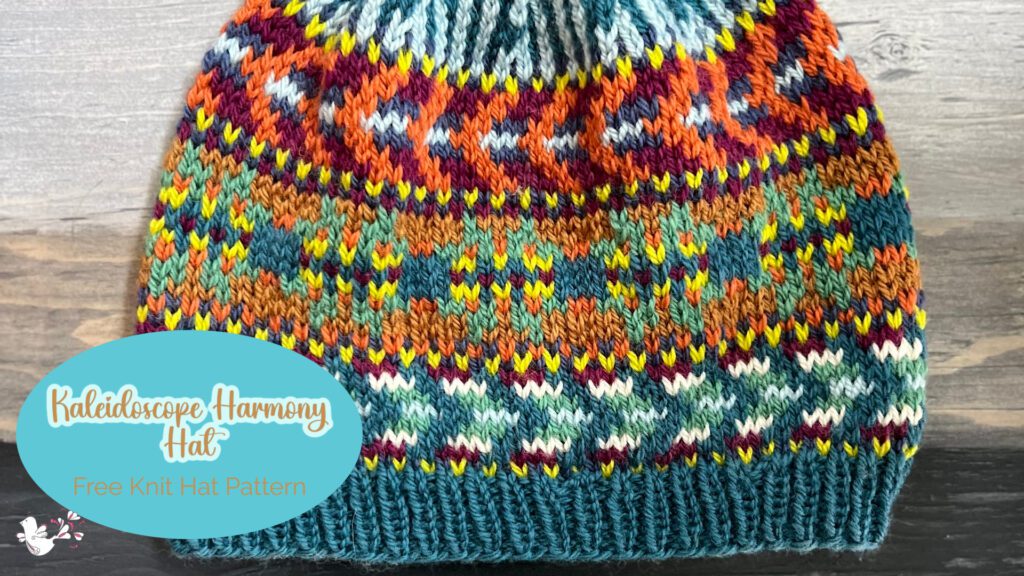
I couldn’t be more excited to introduce you to a truly captivating and versatile knitting project – the Kaleidoscope Harmony Knit Hat. This lovely knit beanie is perfect for those of you who enjoy the art of stranded knitting. This colorwork knit hat pattern will not disappoint. Knit those mini hanks or scrap yarn into this stunning knitted work of art.
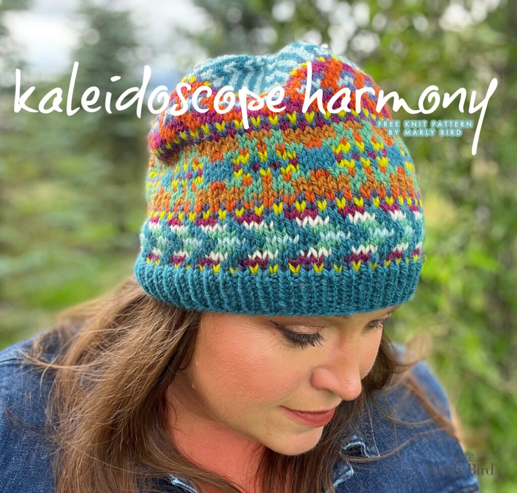
Let me start by saying that this colorwork knit hat pattern is an absolute delight to work on. Combining different colors and simple pattern charts gives the finished product a mesmerizing kaleidoscope effect. It’s like wearing a work of art on your head! Whether you’re a seasoned knitter or just starting, you’ll be completely engaged and entertained every step of the way with this project.
One of the things I love most about the “Kaleidoscope Harmony Hat” is how it allows you to experiment with various color combinations. You can let your creativity run wild and create your unique colorways. I designed this colorwork knit hat pattern in a way that allows you to easily incorporate different shades and hues, making it a truly personalized piece.
So, if you’re ready to dive into the world of stranded knitting and colorwork, grab your knitting needles, and let’s embark on this colorful journey together. Whether you choose to use this colorwork knit hat pattern for yourself or as a special gift for a loved one, I guarantee that the experience will be both enjoyable and satisfying. Stay tuned for my next post. I share useful tips and tricks to get you started on your “Kaleidoscope Harmony Hat” adventure. Happy knitting!
What is Fair Isle Knitting?
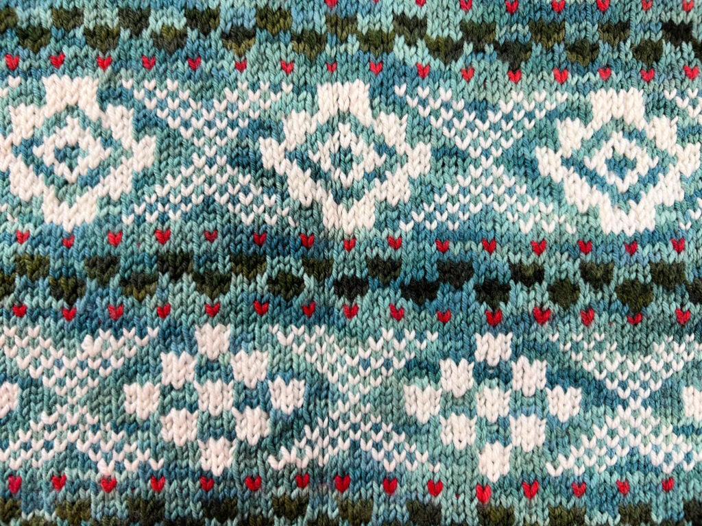
This isn’t just some old knitting technique; it’s a vibrant tradition born in the Shetland Islands, where knitters first began knitting tales and traditions into their jumpers with each color they added.
Traditionally, you’d never see more than two colors per round, but the number of colors overall could be unlimited. However, the color palette was typically only that of locally dyed yarn. Projects made from pure Shetland Wool from the Shetland Islands are considered true Fair Isle.
Something to note about knitting with color with the Fair Isle knitting technique: as the knitter transitions from one color to the next, the unused color floats behind the stitches on the needle. Usually, the float does not travel more than 3-5 stitches. Also, the traditional patterning for Fair Isle colorwork is an X and O design.
Are Stranded Colorwork and Fair Isle Knitting the Same Thing?
So, the long and short answer is that Fair Isle is a specific technique in stranded colorwork. Here’s what most people think when they use the term ‘Fair Isle’ to describe a colorwork project:
- Involves working with multiple colors in the same row.
- Creates beautiful patterns and motifs.
- Carry two or more colors of yarn across the back of your work while knitting with the active color.
This is NOT FAIR ISLE but Stranded Colorwork.
Why is it not Fair Isle?
Because the project, as described, doesn’t fit all three criteria to be called Fair Isle Knitting.
Listen, we can clearly see the term ‘Fair Isle’ has become the go-to term for all sorts of stranded colorwork in today’s society. The general public has loosened up the rules of calling something Fair Isle. Still, the true traditionalists believe that calling everything Fair Isle when it does not meet all the criteria to be so lessens the history of the Shetland culture and devalues true Fair Isle.
What are the three rules for a project to be considered truly Fair Isle?
- The stitch pattern features the traditional X and 0 design.
- The project only has two colors working at a time.
- Project is made from pure Shetland Wool from the Shetland Islands.
If a project cannot check off all three of the criteria, then its default technique is stranded colorwork knitting.
Where Can You Learn More About Fair Isle?
A long-time friend, Mary Jane Mucklestone, is my go-to resource for learning more about Fair Isle! Her books are a staple in my library, and I encourage all of you to purchase her books for your library.
Things You Should Know For Stranded Colorwork
When you start your journey with stranded colorwork, you will immediately come across some different charts and terms that may not be familiar to you. So, to help you along, here is a basic list of things I think you should know before you start any colorwork knit hat pattern, knit sweater, or knit…anything!
How to Read a Colorwork Knitting Chart
Reading a colorwork knitting chart is like following a map that guides you through a landscape of stitches and hues. Most stranded knitting projects typically work in the round (that means no purling or purls in the body of the work!). You’ll interpret the chart in a specific direction: starting from the bottom row and moving upwards, reading each row from right to left—just like how you knit in the round.
Here’s an example of a stitch pattern worked across 7 stitches and 13 rows. Notice the row numbers are on the right of the chart. That indicates you’ll read each row from that side of the chart. This chart includes the color key for each stitch as well.
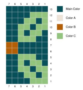
Effectively navigate a colorwork chart
- Orientation: Begin at the bottom right of the chart, as this corresponds with the first stitch of the first round. Charts typically have row numbers to the right to guide you, just like the numbered rounds on the Kaleidoscope Harmony Colorwork Knit Hat Pattern.
- Chart Representation: The chart is a visual representation of your knitting. Each square on the chart is one stitch, and the color of the square tells you which color yarn to use for that stitch.
- Repeats: Many charts show a set of stitches that are repeated around the project. For instance, one horizontal row of squares on the chart may repeat several times to complete one round of your hat. This is why charts often reflect a stitch pattern or colorwork motif repeat rather than the entire round.
- Markers: Place stitch markers on your needles after each pattern repeat to keep your place and make spotting errors easier. This breaks your knitting into manageable sections and allows you to track your progress more accurately.
- Working the Rounds: When you reach the end of a chart row, you circle back to the first square of that same row and begin again, repeating the pattern as many times as necessary to use up all the stitches in the round of your hat.
- Right Side Representation: Remember that the chart shows the right side (RS) of your work. This is what your knitting looks like from the side seen when worn.
Reading a colorwork chart requires a bit of practice, but once you get the hang of it, it’s a skill that will serve you well in all your colorwork projects. With each round of the Kaleidoscope Harmony colorwork knit hat pattern, you’ll see the design unfold, stitch by vibrant stitch. Follow the chart and watch your knitting come to life.
What is Color Dominance?
Color dominance in stranded colorwork knitting is a subtle but impactful aspect of knitting with two or more colors. It’s all about which color stands out more on the right side of the finished fabric. When you’re knitting with multiple colors, one of those colors will naturally appear more prominent, or “dominant,” on the right side of the work, while the other color will seem to fall into the background. This isn’t random—it directly results from the placement of the yarn as it’s carried along the work’s wrong side (WS).
Here’s the technical part: the dominant color is typically the one sitting underneath the other color on the WS. Because the yarn carried underneath travels slightly farther to reach the next stitch, giving that stitch a bit more yarn and thus making it slightly larger and more pronounced on the right side. The other color, receding into the background, is the one that is stranded over the top on the WS.
Dominance in Colorwork Charts
When you’re following a colorwork chart, there’s often a key to indicate which color should be the dominant one and which should fade into the background. This is crucial for the overall look of the design, as it helps the motifs to pop and be more visually striking.
For many knitters, managing color dominance involves holding the dominant color in one hand (often the left) and the background color in the other (often the right), ensuring the way they cross on the WS remains consistent. Always carry the dominant color below the background color to maintain its prominence throughout the piece.
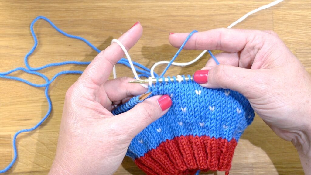
Consistency is key. If you swap the positioning of your yarns halfway through, you’ll notice a shift in your fabric where the motif doesn’t stand out as intended. It’s one of those magical knitting techniques that can transform a flat piece of colorwork into something with depth and vibrancy.
If you want to test out what colors you want to be more dominant…swatch, swatch, swatch!
In the context of the Kaleidoscope Harmony colorwork knit hat pattern, paying attention to color dominance means that the chosen dominant color will really shine, making the intricate patterns and shapes of your hat stand out beautifully, achieving that kaleidoscopic effect that makes the design so captivating.
How and When to Weave, or Tucking or Catching the Float
In stranded colorwork knitting you’ll hear about “weaving,” “tucking,” or “catching” a float. This refers to the technique used to manage the long strands or “floats” of yarn that run across the back of the work when using multiple colors. These floats occur when you carry a color of yarn across the back while knitting with another color. If these floats are too long, they can catch on fingers or buttons or cause the fabric to bunch up.
What it means to weave, tuck, or catch a float
- Weaving or Catching a Float: As you knit with one color, you periodically “catch” the float of the other color by bringing the unused yarn over or under the yarn that’s currently being worked. This traps it against the fabric. Do this every few stitches to keep the float short and secure. I recommend you catch floats every 3-5 stitches to prevent them from becoming too long.
- Tucking: This is another term for the same process. Gently wrap the yarn not used around the working yarn, securing it in place until it is needed again.
This technique helps to:
- Maintain the fabric’s elasticity, as long floats can restrict the stretch of the fabric.
- Keep the inside of the work neat, which is especially important for items like hats or gloves where the inside can be visible or touch the skin.
- Prevent tangling and snagging of long floats on the wrong side of the work.
When knitting the Kaleidoscope Harmony colorwork knit hat pattern or any other project with stranded colorwork, mastering how to weave in your floats is key to creating a beautifully finished piece that’s as pleasant to look at on the inside as it is on the outside. I have a video to help you weave or catch your floats on the Marly Bird YouTube Channel.
What is Float Porn?
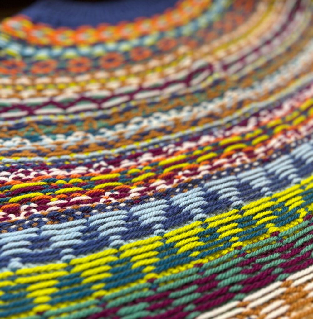
Here’s the wonderful aspect of this stranded knitting technique. The ‘wrong’ side is not just the backstage to the color show happening on the front; it’s a world of its own. Around here, we lovingly call it “floatporn.” Why? Because of those floats of yarn on the back! It’s simply stunning when worked in balance and harmony. They’re the unsung heroes, the intricate network that holds our colorwork canvas together.
The term celebrates the often unseen side of colorwork knitting, where the carried yarns, or “floats,” create their own intricate pattern on the reverse side of the fabric.
Have floats twisted around each other, too tight or too loose, and the entire knitted fabric can be a mess. Yet when floats balance perfectly, the ‘wrong’ side is a work of art.
Stranded Knitting Patterns by Marly Bird
Call me a traditionalist, but I try hard to call any of my stranded colorwork, well, stranded colorwork instead of Fair Isle. Because I’ve never made anything with Shetland Wool, I immediately don’t meet all 3 of the criteria. But I do LOVE working with colors and the stranded colorwork technique.
Using this amazing knitting style, I have designed sweaters, ponchos, mittens, hats, and bags. It’s one of the best ways to use color in my work; you know I love it!
Here are some of my most popular patterns using knit colorwork
- Harmony Hues
- Color Kaleidoscope Poncho
- Christmas Flower Knit Cowl
- Disruptive Locomotive Hat
- Chocolate Hearts Hat
- First Fall Weekender Knit Bag
- Game Day 2022 Knit Hat and Fingerless Mitts
- Heartstrings Socks (there is even a course to teach you too)
- Turkey Trot 2022 Shawl/Bandana
- Many Holiday Stockings (there is even a course to teach you too)
- Feel The Heat Mittens (video tutorial too)
- Boxed In Fingerless Mittens
- Ketchikan Fingerless Mittens
- Game Changer Cowl
- Game Day Cowl
- Chill Out Winter Hat (free pattern + video tutorial)
But don’t worry, you don’t have to be a knitting expert to try your hand at stranded colorwork. I taught the students in the BiCrafty Bootcamp for knitters how to knit with two colors (one color in each hand) for their first hat, and they succeeded. You can too! Do you want that pattern? Get started with it here.
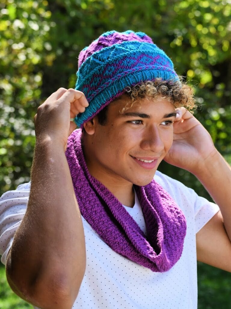
Trust me, there are plenty of beginner-friendly Fair Isle (or, I should say, stranded colorwork) patterns and tutorials out there to help you get started. And remember, when you knit, it’s just sticks and string. You can do anything! Just tell yourself you can! 😉
So grab your knitting needles, pick out some colorful yarns, and dive into the wonderful world of Fair Isle…ahem…stranded colorwork. You’ll be amazed at the stunning designs you’ll create with just a little patience and practice!
Stash Diving: What Yarn is Best for Stranded Knitting?
Choosing the best yarn for stranded colorwork is quite an adventure, given the sheer abundance of options. You’ve got a world of fibers, textures, colors, and weights at your fingertips, but when it comes to colorwork, a few considerations can help guide your choice.
The golden rule for selecting yarn for colorwork is to go with something blockable, with wool or wool blends being top of the list. Wool is lauded for its ‘memory,’ meaning it can return to its original shape after stretching. This helps your stitches settle neatly into place and maintain the shape of your garment over time.
Close Encounters of the Yarn Kind
When you’re out there feeling your way through the yarns at your local yarn shop (LYS), you’ll encounter everything from hearty, woolly textures to the sleekness of plied superwash Merinos. Rustic wools, like Shetland yarn, are particularly forgiving for colorwork. Their fuzzy, furry nature works wonders for smoothing over tension variations, making your colorwork look even and well-defined.
In contrast, smoother and rounder yarns, like single-ply superwash yarns, can be trickier as they tend to slip past each other easily, potentially highlighting imperfections in tension. Plus, superwash yarns are known to ‘grow’ when blocked and with wear due to their stretchy nature. So, if you opt for superwash, do block your swatch and keep in mind that it may affect sizing over time.
Color, Color, and More Color!
And let’s not forget the joy of color! Colorwork begs for a palette that’s as expansive as your imagination. Opting for a yarn line with a wide range of colors allows you to play and experiment, creating a stash that’s a treasure trove of possibilities for any spur-of-the-moment colorwork project.
If you’re feeling adventurous, you can even mix and match yarns from different brands, types, and weights. Imagine combining aran with worsted, or DK with sport weight in the same project—this can elevate your work’s textural and visual complexity. Even holding a sock weight yarn double can allow it to play nicely alongside heavier yarns in your colorwork.
So, as you embark on this journey, let your swatching be your guide. Whether you’re crafting a cozy poncho or the Kaleidoscope Harmony Colorwork Knit Hat Pattern, finding the right yarn is the first step to a successful and satisfying colorwork experience.
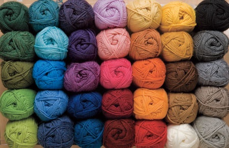
The Beauty of Creating Something Unique with Mini Hanks, Yarn Scraps, and Leftover Yarn
Oh, the irresistible allure of mini skeins! They beckon to us, don’t they? Their riot of colors is like candy for the crafty soul, gleaming from the store shelves or glowing from our computer screens. It’s no wonder we find ourselves with bins brimming with these little bundles of joy. Yet, often, we’re left pondering the perfect project to showcase their full potential.
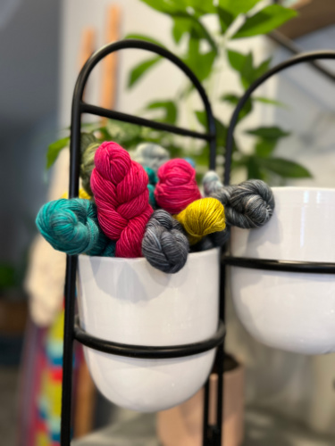
Enter the stage: the Kaleidoscope Harmony Colorwork Knit Hat Pattern. It’s as if I dreamt up this hat just for these pint-sized pretties. With its spectrum of shades, each round becomes a canvas for the vibrant rainbow that mini skeins can create. The hat’s design calls for just a dash of each color, making those mini skeins the ideal candidates.
Got Yarny Leftovers?
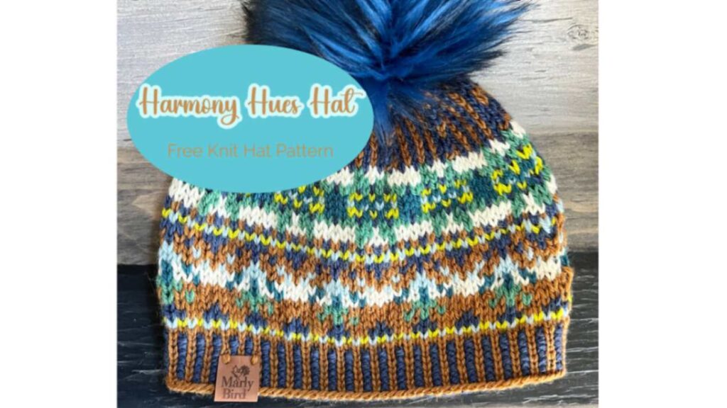
But what about those leftover yarns? Those precious remnants from projects past that aren’t quite enough for a solo act but are too beloved to be forgotten. This hat embraces them all, weaving together the odds and ends into a mosaic of memories. That is actually how I came to design this hat. I had remaining yarn from my Color Kaleidoscope Poncho Pattern and wanted to use it up. So, I designed this hat and the Harmony Hues Hat with that scrap yarn. And I still have more yarn I can use to make even more hats!
This is more than just a hat; it celebrates every scrap, a declaration that nothing is too small to shine. As you knit, you’re not just reducing your stash—you’re giving new life to every last yard of your favorite fibers. And when you’ve bound off the last stitch, you have a stunning, one-of-a-kind creation and the perfect excuse to replenish your collection without an ounce of guilt. After all, who can resist the call of new skeins, especially when they promise another adventure in colorwork?
Kaleidoscope Harmony Colorwork Knit Hat Pattern
My friends, we’ve yarned about Fair Isle, chatted up those stranded colorwork skills, and geeked out on the primo yarns (and scraps) that’ll make our stitches sing. And now? It’s time to scoop up that free pattern for the oh-so-gorgeous Kaleidoscope Harmony Hat!
Whoa there, hold onto those circulars for just a smidge longer! Before you start casting on and getting lost in the rhythm of those stitches, take a quick trip over to Ravelry. Let’s give this pattern a little love by adding it to your queue and smashing that ‘Favorite’ button. It’s like giving your future self a high-five because you’re gonna want to come back to this one.
Got it queued? Favorited? Perfect. Now, grab those scrumptious mini skeins and those precious leftover yarns that have given you the eye. It’s our time to shine and stitch up a storm with the Kaleidoscope Harmony Colorwork Knit Hat Pattern.
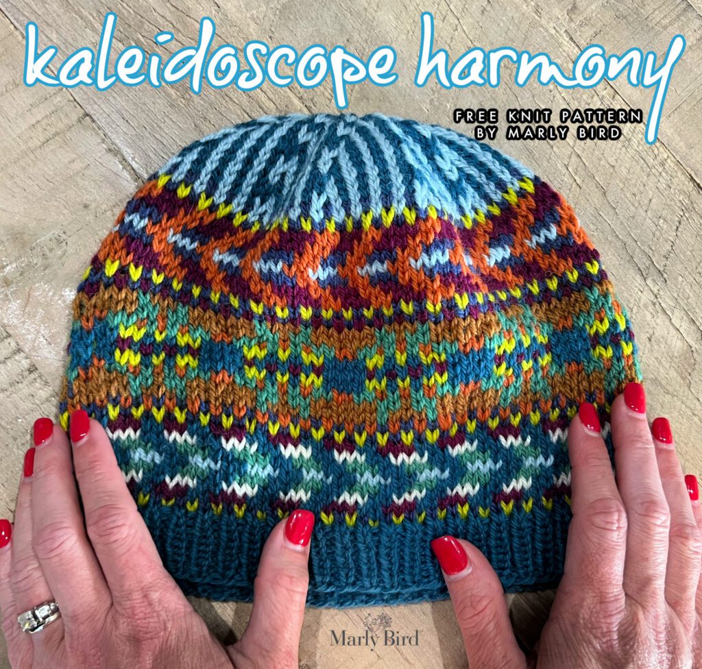
The Kaleidoscope Harmony Hat – Designed by Marly Bird
Skill Level: Intermediate
Measurement(s)/Size(s)
To Fit Size
Average Adult
Finished Measurements
The finished hat size is 22″ [55.88 cm] circumference; 8.7″ [22 cm] tall
Gauge
20 sts and 24 rounds = 4” [10 cm] in Fair Isle knitting stocking st and larger needle.
Materials
The materials for this hat include no more than 20 grams of 9 different colors of worsted weight yarn (often less than that). Wool yarn (or lambswool) is preferred for this project, but acrylic will work if you’re allergic to wool.
Yarn
Contrast A Indigo (77772) 1 ball
Contrast B Rich Raspberry (77783) 1 ball
Contrast C Pumpkin (77605) 1 ball
Contrast D Sprout (77759) 1 ball
Contrast E Rich Grass (77764) 1 ball
Contrast F Seafoam (77219) 1 ball
Contrast G Rich Teal (77768) 1 ball
Contrast H Aran (00202) 1 ball
Contrast I Brown Mustard (77757) 1 ball
Knitting Needles
Knitting needle size U.S. 8 [5 mm] 16” [40.5 cm], also size 9 [5.5 mm] circular knitting needles 16” [40.5 cm] and set of 4 double pointed needles or size needed to obtain gauge.
Notions
Stitch marker, tapestry or yarn needle, optional pom pom
Common Knitting Abbreviations
Approx – Approximately
Beg – Beginning
Inc – Increase(ing)
K – Knit Stitch
Kfb – Increase 1 stitch by knitting into front and back of next stitch
K2tog – Knit two together
P – Purl Stitch
PM – Place marker
Rep – Repeat
Rnd(s) – Round(s)
RS – Right side
SM – slip marker
Tog – Together
Special Knitting Stitches and Video Support
Knit Front and Back (Kfb): Knit through front and back of next stitch – 1 stitch increased. https://youtu.be/k9rWymMDxgM
Knit Two Together (k2tog): Knit 2 stitches together – 1 stitch decreased.
How to Knit in the Round: https://youtu.be/JVEi7YPmXnc
How to Knit Fair Isle Technique: https://youtu.be/PQJoqlwL1OQ
How to Weave or Catch Floats: https://youtu.be/TNVVI0iGqvs
How to Add a Life Line: https://youtu.be/l4YD0A8MNCc
How to Bury Your Ends: https://youtu.be/8_NBGUKjO-E
🏕️ Get the BEST colorwork class on the internet for 50% off with code: KALEIDOSCOPE
Notes
- The hat’s brim is worked in a 1×1 ribbing with smaller knitting needles, but the body of the hat is worked in stockinette stitch with the Fair Isle technique and larger knitting needles.
- When working in the Fair Isle technique, carry yarn not used loosely across WS of work but never over more than 5 sts. When it must pass over more than 5 sts, weave it over and under color in use on next st or at center point of sts it passes over. The colors are never twisted around one another.
- When a color is finished being used in a section, cut it and carry on. Do not carry colors up the inside of work.
- Maintain the colorwork chart knitting instructions for the crown of the hat.
GROW
To Unlock Exclusive Subscriber Content click the Box below and join for free by simply adding your email and creating a password! If you are having troubles, clear your cache or reset your password or login to the Grow Publisher Portal.
>> Learn More About Grow Here <<
I’m thrilled to share this amazing pattern with you, many patterns on my blog are absolutely free! I kindly request that you don’t copy and paste or distribute this pattern. Prefer an ad-free experience? Buy a digital PDF pattern for a small fee from one of my online stores for a seamless crafting journey.
I appreciate your support and readership. You are the reason I can keep doing what I love and sharing it with others. So, thank you from the bottom of my yarn-loving heart! Disclosure: This post contains affiliate links, meaning I get a commission if you decide to make a purchase through my links at no cost to you.
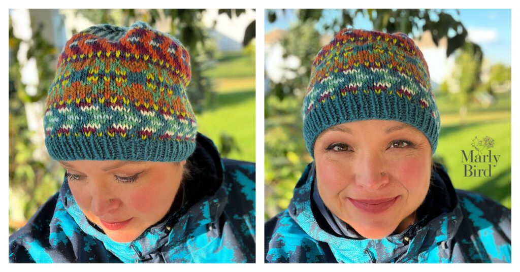
Kaleidoscope Harmony Colorwork Knit Hat Pattern
Body
Recommend adding a stitch marker between each repeat of the chart. Make sure the beginning of the round marker is a different color or style than the ones separating the repeats around the body.
1st – 10th rnds: Knit Chart I, reading rnds from right to left, noting 10-st rep will be worked 11 times.
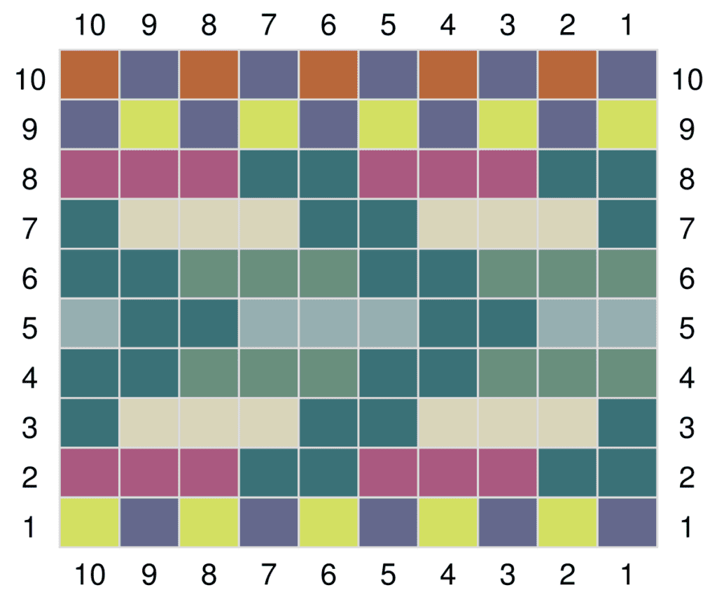
The stitch multiple of this chart changes, remove the markers from the previous chart, and place markers to the new location and continue.
11th – 19th rnds: Knit Chart II, reading rnds from right to left, noting 11-st rep will be worked 10 times.
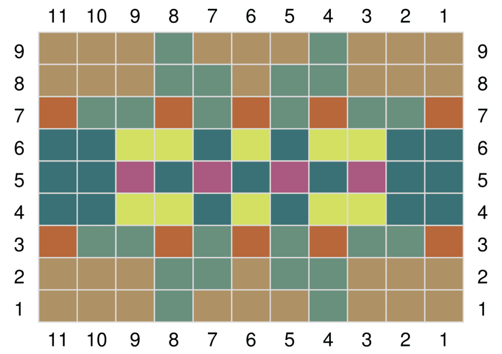
The stitch multiple of this chart changes, remove the markers from the previous chart, and place markers to the new location and continue.
20th – 30th rnds: Knit Chart III, reading rnds from right to left, noting 10-st rep will be worked 11 times.
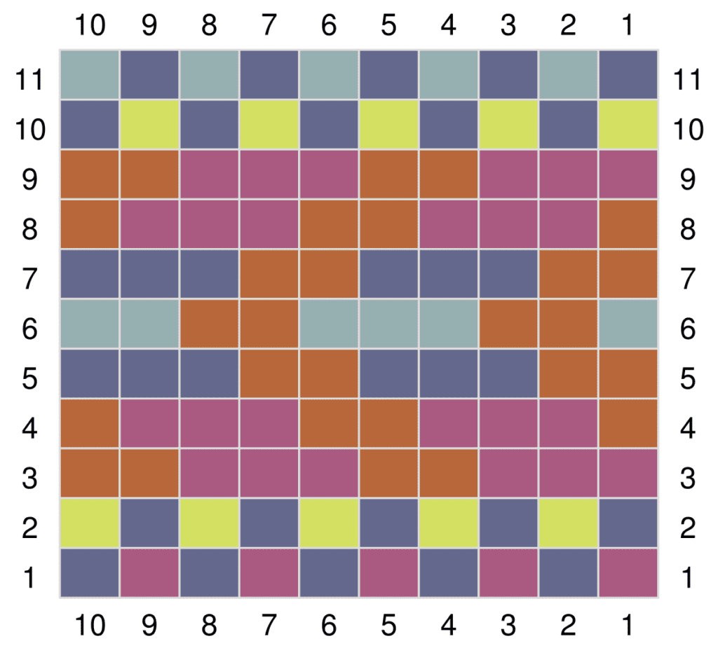
Remove all the stitch markers BUT the one at the beginning of the round. Continue to the crown shaping.
Crown
Knit Chart IV, reading rnds from right to left, noting decreases will will be worked 11 times.
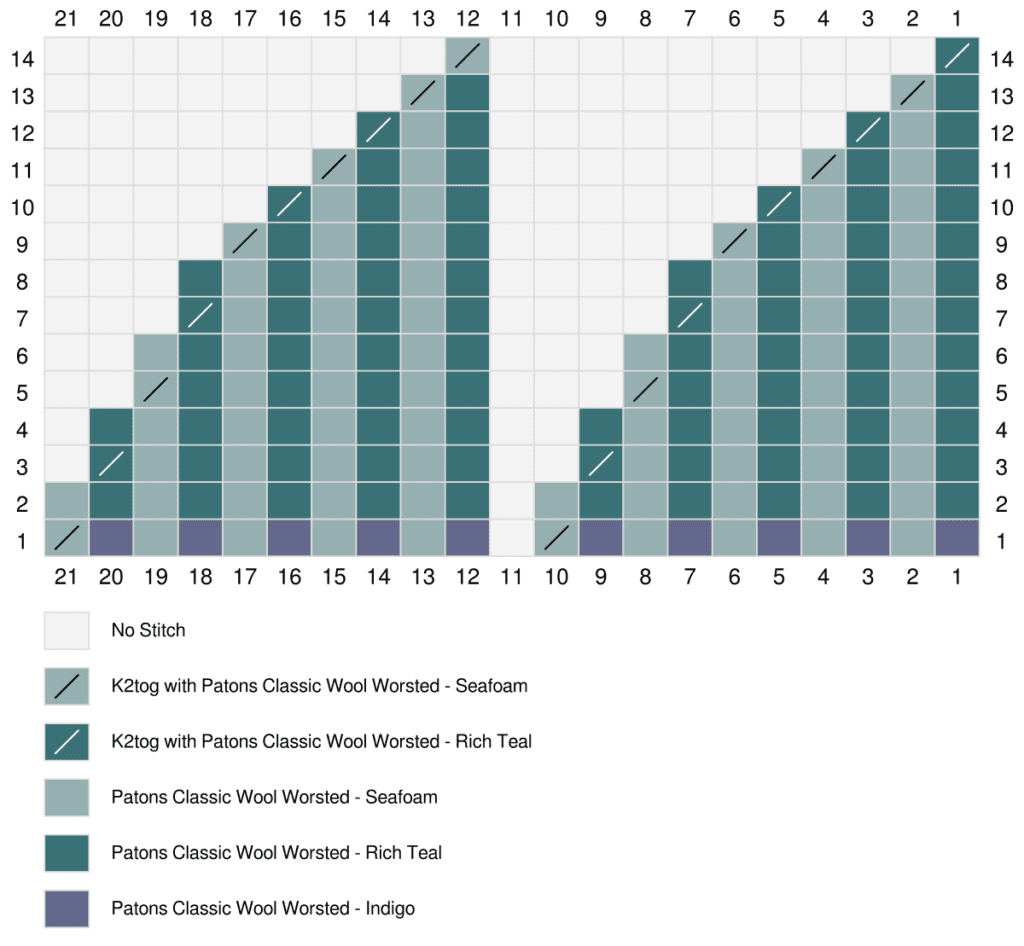
FINISHING
Weave in ends. Hand wash the hat, then lay flat to dry. When completely dry, add a removable pom pom (optional)
Get the pattern PDF free from Yarnspirations. Click Here
Share With Marly #MMMDI
Alright, my lovely knitters, you’ve got the pattern, you’ve got the know-how, and you’ve got an array of yarn scrap colors at your beck and call. Now’s the moment to take that Kaleidoscope Harmony Colorwork Knit Hat Pattern and make it sing your tune!
Remember, a pattern is just the beginning. It’s the springboard for your creativity. From bright, vibrant colors to the most laid-back, cool-tone hat, your unique touch will turn this pattern into a treasured piece.
So go on, cast on with confidence, and let every row be a celebration of your yarn journey. We can’t wait to see the wonders you’re about to create. Share your finished hats with us, tag them, flaunt them, and most of all, enjoy every moment of your crafting adventure. Knit on with joy because you, my friend, are about to create something spectacular!

